Wind distribution compass
The stats page on my weather station site has always had an all-time wind distribution table. The idea is to get some sort of idea of where the wind generally blows from at my location. While it does give that information it doesn't really have that "at a glance" feel to it that you really want.
This morning I decided that this data might also work well as a "compass graph":
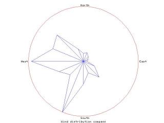
I think that does a very good job of giving a "at a glance" appreciation of the data. What's really interesting is that the two main peaks are west and south-south-west. Generally the prevailing winds in this part of the UK are from the south-west so you'd expect the peak to be there. I suspect that the reason for the result you see above is that there's a house to the south-west of my setup and it's creating a wind shadow.


2 comments:
Hi Dave,
I described this graph to my observing partner stating that the peaks represented both the direction of the wind and the magnitude of the wind. If I read the data correctly now, he corrected me by saying that the graph will show the percentage of time that the wind blew a given direction. The count column respresents that?
peter
Yeah, that's right, it's a graph of the number of times I've recorded a given wind direction (where the wind-speed has been above 0mph — that's the only part speed plays in this, no point in recording a direction if there was no actual wind blowing).
The idea is to try and show where my prevailing winds are. What it also shows is that the house that's about SW of me causes a wind shadow.
If you look at the graph now on my site you'll also see there's a red line that has been added. That's the overall average direction.
Post a Comment